09 Abr COMA by Sanserif Creatius in Design Milk
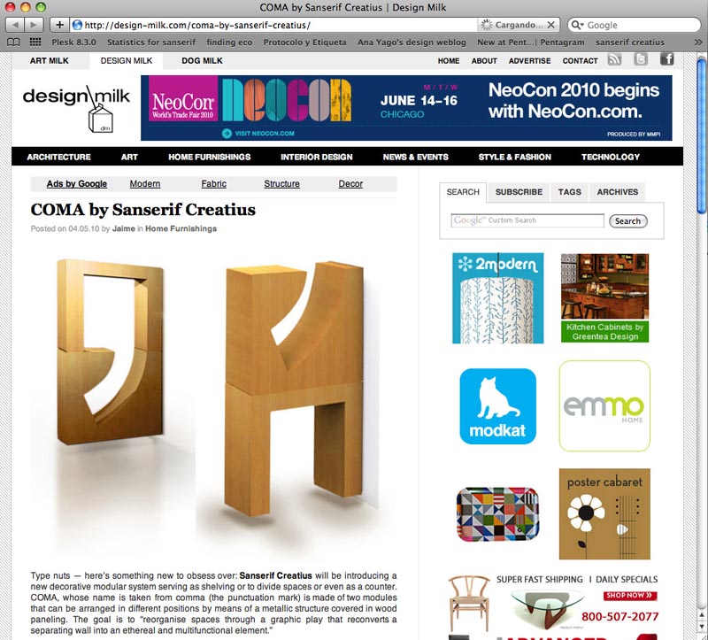
COMA by Sanserif Creatius in Design Milk. Type nuts — here’s something new to obsess over: Sanserif Creatius will be introducing a new decorative modular system serving as shelving or to divide spaces or even as a counter. COMA, whose name is taken from comma (the punctuation mark) is made of two modules that can be arranged in different positions by means of a metallic structure covered in wood paneling. The goal is to “reorganise spaces through a graphic play that reconverts a separating wall into an ethereal and multifunctional element.”
Design Milk· 04/04/2010
COMA divides space with typography…Similarly to the way in which punctuation marks indicate parts of a sentence and structure a text, COMA organises spaces without physically separating them. Furthermore, its modular structure enables it to act as a simple arrangement of space while at once transforming itself into a counter, shelving, a display unit or a container, among other possibilities.


