02 Abr Sanserif Creatius recovers the pictograms as a language of communication for the contemporary ceramic
Designers from Sanserif Creatius recover the pictogram as language of communication for the contemporary ceramic in the collection “Dual Year” to the young editor of handmade products Limoceramics, that has edited an exclusive series of its referential piece “Trío” with recreations of cultural Japanese symbols to commemorate the Dual Year Spain-Japan.
This series, called “Dual Year” joins the graphic collaborations motivated by Limoceramics with some of the main referents of graphic design and current comic, the case of Mark Lazenby, Jen Felton, Milimbo or Juan Antonio Blasco, and now Sanserif Creatius, young studio with international projection that recently has been finalist of the National Craftsmanship Awards, besides of receive mentions and recognition in events such as the Tortona Design Week of Milan, or to be chosen as the only Spanish representatives in the EcoFuture exhibition in Abu Dhabi (EA).
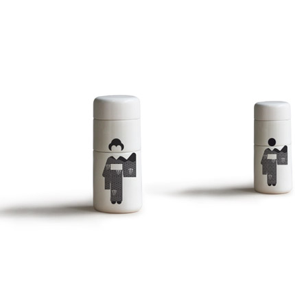
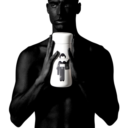
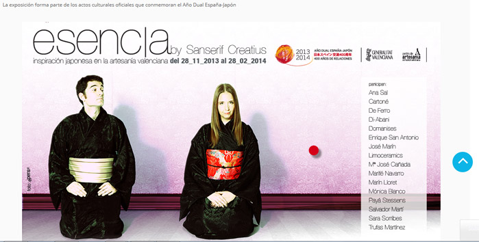
“Trío” is a group of different pieces stackable made in transparent varnish, composed by two bases and a tap, that allow different compositions and uses. Thus, they can be set as a unique tower or be decomposed into different pieces, playing with the graphic compositions that decorate it. And, in this case, they incorporate adaptations of traditional themes of Japanese folklore such as the cherry-tree flower, bamboo, or the unisex use of the kimono, specifically this last graph is the one that has been presented in the international exhibition Esencia 2013, Japanese inspiration in Valencian craftsmanship.
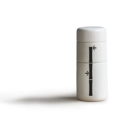
Limoceramics’ bet for a simple and original design, in which ceramic is the protagonist, is combined in this occasion with a series of graphic minimalistic interventions of the designers Ana Yago and José Antonio Giménez, in which they play with pictographic metaphor that recreate through silhouettes the spring-like festival (Hanami) that announces the appearance of the Japanese cherry-tree flower or Sakura; the traditional clothing –kimono- or the presence of the bamboo in the Japanese culture and philosophy that lionises its resistance, flexibility and simplicity of the forms.
The idea of bring closer folkloric concepts or rituals to our philosophy of work in which sustainability and nature have an important weight, as has explained the director of Sanserif Creatius, Ana Yago. And, for example, she has reminded that the image of the of the petals of these flowers that fall in the beginning of the spring, specially in April, symbolises the beauty of nature and the rebirth of life as a new beginning.
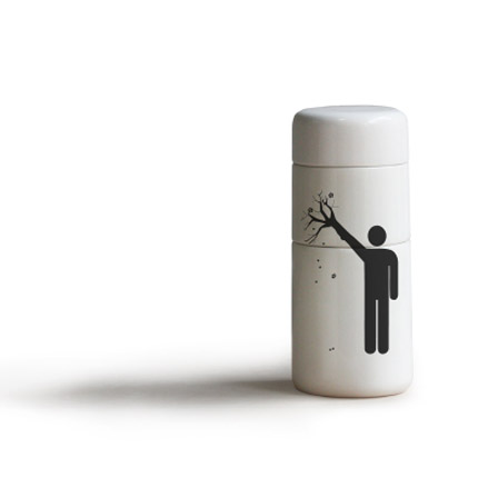
This piece is part of the products developed for the investigation project Esencia, supported by the Centre of Craftsmanship of the Comunidad Valenciana, the Spanish Foundation for Innovation of Craftsmanship (Fundesarte) and the Economy, Industry, Tourism and Employment office, with the aim of bring closer the handmade products to the demands of the contemporary society, at the same time that new markets for the craftsmanship sectors that are in recession. In fact, at the moment, in the exhibition it can only be seen one of the pieces of the collection, specifically “Trío both”, in which the use of the kimono indifferently for man and women, as the tradition in Japan, through a pictogram game that recreate the head of a man and a woman, with the same body.


